
About The Project
Lit Path is a nonprofit organization that seeks to provide resources and aid for those seeking addiction therapy.
For Develop for Good’s program duration of 3 months, our goal was to make Lit Path’s website more professional and intuitive for three different users: donors, therapists, and scholarship applicants. My main assignment was to design and facilitate implementation of the Scholarship Application Page.
My Role: UX Designer
Tools Used: Figma, Figjam, Google Forms, Notion
Research
Using Google Forms, we conducted personalized surveys for the 3 main user groups: potential donors, therapists, and potential scholarship applicants seeking mental health care.
All surveyed potential scholarship applicants were unaware of resources and opportunities and 89% attributed financial constraints or lack of insurance coverage as a major challenge to accessing care.

User Personas
Our insights gathered from research led to the creation of the following personas based on the target audience. With the 3 personas, we were able to further empathize with the users by understanding what their goals and current challenges are, so that we could design and develop solutions that would meet those needs.

User Journey
We then complemented each user persona with their respective user journey mapping. Mapping the experience of the scholarship applicant persona helped me visualize how the user may interact with the current Lit Path website.
The user journey map supported the existing user pain points shared by our clients, as well as highlighted new pain points to consider when starting the design process. The identification of these new pain points allowed me to see opportunities to improve the user experience.

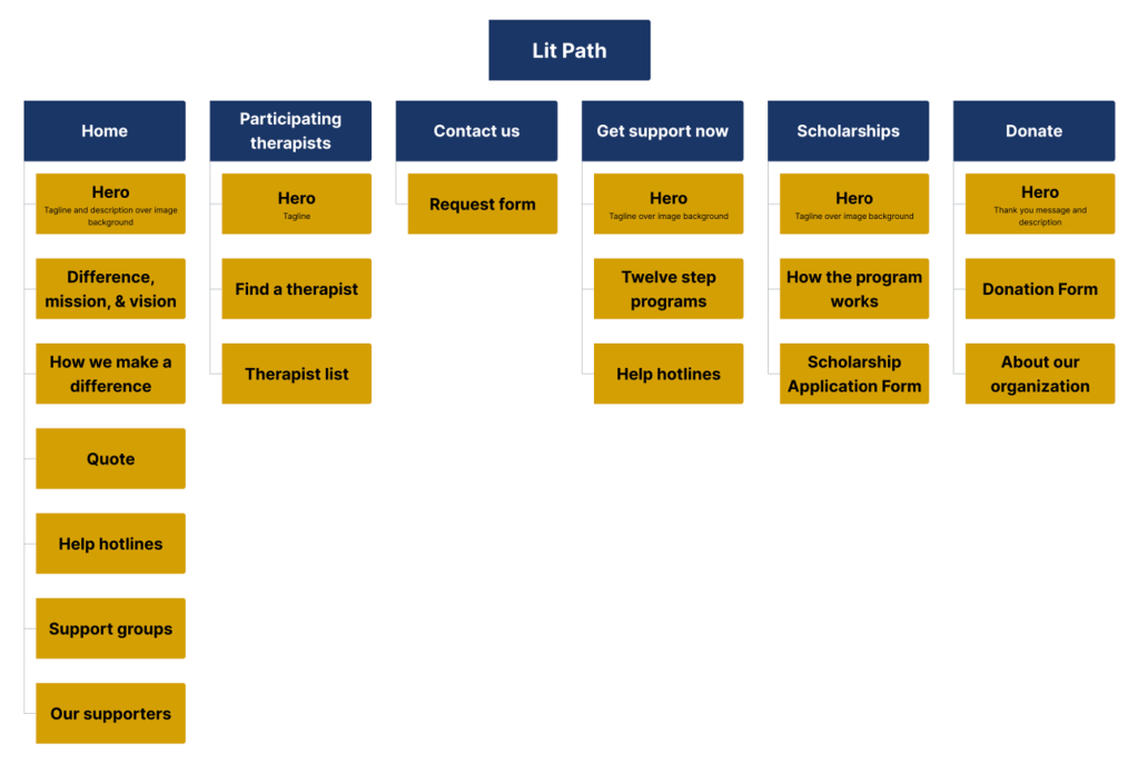
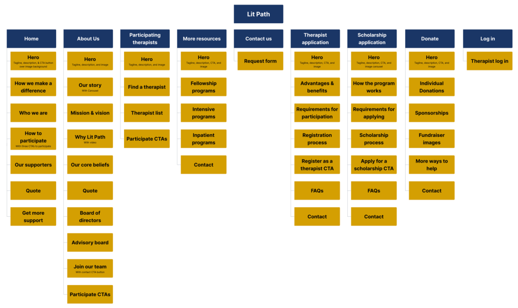
Information Architecture
We redesigned the site map to enhance navigation and improve content organization, ensuring information is structured intuitively across relevant pages. For the scholarship application page, using feedback from user surveys I proposed a more detailed layout that provides clear information about the scholarship, along with an FAQ section to address common questions from potential applicants. This adjustment aimed to better inform applicants and streamline the application process.
Low Fidelity and Mid Fidelity Wireframes
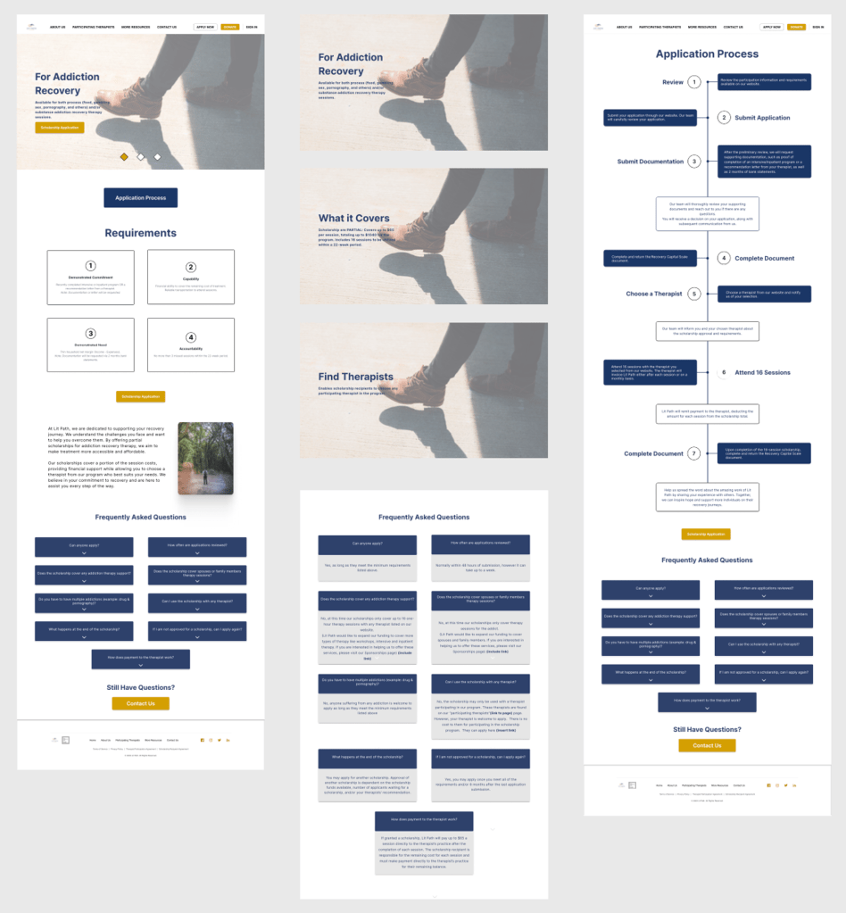
Below are the low and mid fidelity designs of the scholarship application page that were created on Figma!
For the lo-fi wireframe, I first ideated several potential designs that I would propose to the team and decide on which concept to advance as a mid-fi wireframe.
The mid fidelity wireframes helped refine the chosen concept, visualize the hierarchy and interaction of the page, and keep the focus on the structural and interaction aspects before transitioning into the high fidelity designs.

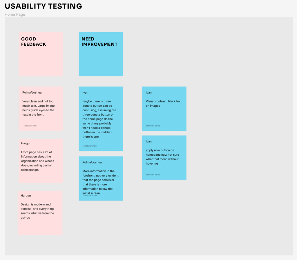
Usability Testing and Feedback
We conducted usability testing on our overall design to see how potential visitors to the website would react to our mid-fidelity designs. When users responded well to different design features, it further reinforced the decisions made when creating the mid-fidelity wireframes.

Final Design
To address problems with UI inconsistency the team adopted a design system established by our design manager and implemented it in our page designs. The establishment of a design system as well as the insights received from user feedback resulted in a polished high fidelity design that effectively conveyed the brand identity and enhanced the overall user experience of my design of the scholarship application page.


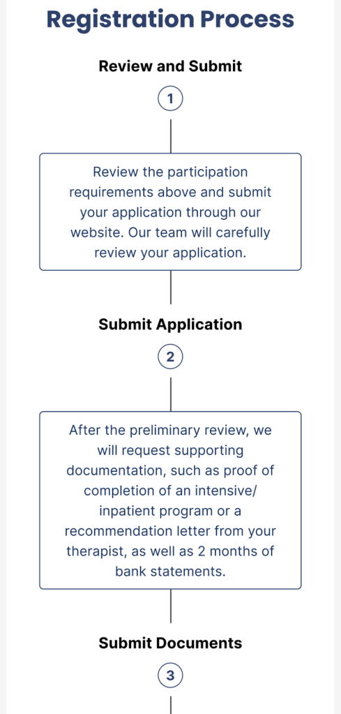
On top of redesigning the desktop version of the scholarship application page, I created a responsive design to fit mobile devices. Since the design had to transition to fit a smaller device, there were some adjustments that had to be made to some parts of the design. To adjust to different screens I had to alter the design for the hero section, the registration process steps, and the FAQ section. The design was translated to still be intuitive for smaller devices and maintained the organization’s brand.


Conclusion
As a result, I was able to design an intuitive and interactive platform for potential scholarship applicants. The responsive design was also successful in being more accessible for those who mainly use mobile devices. Lit Path reported seeing an 82% increase in user registration within the first month of its launch!
Here is what users said about the redesign:
“I love all the additional information the site has now. It gives a much better understanding of Lit Path, what they do, why they do it, and how I can be a part of it.”
“The level of professionalism is WAY better than the old site.”
“The old site was confusing. The new site makes it so much more clear what the cause is and how to take action.”
Reflections
One challenge of this project was translating our desktop design into a responsive design that can fit for mobile users. It had been my first time creating a responsive design and so the trickiest part was thinking about how to translate the design of the registration process steps into something that was easy to navigate on mobile platforms. Our team was a bit back and forth on which design would have been best, but after some responses from users and our clients, I stuck with a more linear design for smoother navigation.
For the future, it may be better to simplify some of the parts of the design. The “Requirements for Applying” section can be simplified with a checklist that can reduce cognitive overload. It can also be more efficient to decrease the amount of unnecessary white space towards the bottom of the page so it is easier to scroll through. It would be beneficial for the organization to release the survey in the future about possible improvements for the site as it can lead to more insights on how to make the website more accessible for the increased user base.
